

Statistical Process Control: Techniques for Feed Manufacturing, Part 2
Tim Herrman
Extension State Leader
Grain Science and Industry
Procedures for Developing a Control Chart
Step 1. Collect samples or measurements during processing. This is similar to Step 1 for the frequency histogram. In some cases, multiple measurements for a particular process are collected, such as when monitoring bag weight or tracking conditioned mash temperature.
Step 2. Perform preliminary calculations with the data set. If there are multiple measurements (subsamples), calculate the average and the range of these measurements. Next, calculate the overall sum and average for these values.
Step 3. Calculate the control limits (upper control limit UCLx and lower control limit LCLx) for the mean and the upper control limit for the range (UCLR). These control limits are set at three standard deviations. A simplified method for calculating control limits involves the use of Table 1, which presents factors for calculating control limits. The A2 column provides a list of factors used to calculate the UCLx and LCLx for data sets with subsamples (Example 3). The D4 column is used to calculate the UCLR. The d2 column is used to calculate the UCLx and LCLx for data sets that contain only one measurement per sampling (Example 4).
Example 3. Bag Weight
Step 1. Collect sample data; in this example 5 bags for 20 lots of feed.
Mean Range
1) 40.00 40.20 40.05 40.00 40.10 40.07 0.20
2) 40.10 40.17 40.15 40.20 40.00 40.12 0.20
3) 39.90 39.95 39.95 40.05 40.00 39.97 0.15
4) 40.05 40.10 40.10 40.05 40.03 40.07 0.07
5) 40.00 40.10 40.10 40.05 40.10 40.07 0.10
6) 40.25 40.15 40.25 40.15 40.15 40.19 0.10
7) 40.30 40.10 40.10 40.30 40.30 40.22 0.20
8) 40.05 40.10 40.05 40.05 40.25 40.10 0.20
9) 40.10 40.10 40.10 40.20 40.20 40.14 0.10
10) 40.10 40.10 40.05 40.20 40.05 40.10 0.15
11) 40.30 40.20 40.15 40.05 40.05 40.15 0.25
12) 40.15 40.30 40.15 40.20 40.20 40.20 0.15
13) 40.00 40.05 40.05 40.05 40.00 40.03 0.05
14) 40.10 40.10 40.04 40.25 40.25 40.15 0.15
15) 40.00 40.10 40.10 40.10 40.00 40.06 0.10
16) 40.12 40.10 40.10 40.40 40.00 40.14 0.40
17) 40.12 40.27 40.25 40.10 40.15 40.18 0.17
18) 40.10 40.10 40.00 40.20 40.10 40.10 0.20
19) 40.30 40.20 40.15 40.15 40.20 40.20 0.15
20) 40.15 40.30 40.10 40.20 40.15 40.16 0.20
Total 802.42 3.29
Avg 40.12 0.16
Step 2. Calculate the averages and range for the subsamples. Then calculate the sum for the mean and range columns (802.42 and 3.29, respectively) and calculate the average by dividing the sum by the number of samples (n = 20) which results in values of 40.12 and 0.16, respectively.
Step 3. Calculate the upper and lower control limit for the range control chart. Select the factor from Table 1 under the column titled D4. (Note: The complete table is published by the American Society for Quality Control.) In this example, select the value from the row n=5, since there are five measurements for each sample collection period (the select value is 2.114). The upper control limit is derived by multiplying D4 by the average range R:
UCLR = 2.114 x 0.1645
UCLR = 0.348
Calculate the upper (UCLx) and lower control (LCLx) limits for the averages. Using Table 1, identify the value A2 based on the number (n=5) of measurements per sampling period. Multiply A2 by the average range, then add and subtract this value from the average mean to arrive at the upper and lower control limits.
A2 times R = 0.577 x 0.1645 = 0.0949
UCLx = 40.121 + 0.0949 = 40.21
LCLx = 40.121 - 0.0949 = 40.03
Step 4. Plot the data on the control chart (Figure 4).
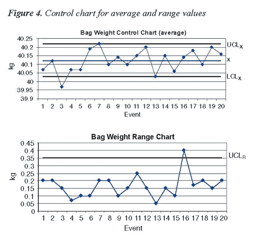
Interpretation of the Control Chart
In Example 3, the following interpretations are included:
- The bag weight data resulted in fairly narrow upper and lower control limits; this indicates that little product is given away.
- The lower control limit of 40.03 kg indicates that there is little likelihood of under filling bags and shorting customers of product when the bagging process is under control.
- Bag weight measurements occur in nearly equal proportions above and below the mean.
- The process, while appearing to perform well, is out of control.
The control chart differentiates between normal population variation and variation due to an assignable cause. Normal variation typically occurs within upper and lower control limits. The UCLx and LCLx were plus and minus three standard deviations from the mean. (Note: Three standard deviations from the mean accounts for 99.7 percent of the variation in a population.)
Thus, there is a low probability (3 in 1,000) that a measurement will fall outside the control limits due to random chance.
For the bag weight control chart (Figure 4), the third event in the average control chart occurred below the lower control limit. Thus, the process was out of control. The cause could be due to failure to calibrate the bagging scale or, perhaps, an error by the operator. The cause and effect diagram can be used to help identify the problem, the control chart only lets us know when the event occurred. Looking at the range control chart in Example 3 (Figure 4) the 16th event resulted in an average range value that was above the upper control limit, again, indicating the process was out of control.
Additional Rules for Interpretation
In addition to assessing if points occur outside the control limits, it is important to detect whether nonrandom patterns of data occur within the control limits. Specifically, if seven consecutive data points occur all above or below the mean (even if they are within the control limits), it is correct to conclude that the process is out of control. To help understand why, consider the probability that you will get heads if you flip a coin; it is 50 percent. Now, what is the probability of flipping two heads in a row? The answer is 50 percent times 50 percent (0.5 x 0.5) or 25 percent. Carrying this calculation through seven times results in a probability of less than 1 percent of getting heads seven times in a row. At this point, we reject the possibility that this event occurred through random change.
Similar to the coin illustration, the possibility of having seven consecutive measurements in ascending or descending order also is unlikely unless there is a change in the process. Thus, if either of these events occur, the process is considered out of control.
Example 4. Individual and Range Control Charts for Finished Feed Protein Content
Step 1. Collect sample data. In this example, the value represents finished feed protein content. There are 28 total measurements.
Batch Number Protein Content Moving Range
1 17.47
2 17.95 .48
3 18.91 .96
4 18.87 .04
5 18.35 .52
6 18.44 .09
7 18.71 .27
8 18.60 .11
9 18.80 .20
10 18.84 .04
11 19.41 .57
12 18.82 .59
13 18.19 .63
14 18.75 .56
15 19.01 .26
16 18.27 .74
17 18.60 .33
18 19.46 .86
19 18.48 .98
20 18.24 .16
21 17.73 .51
22 18.40 .67
23 19.26 .86
24 18.64 .62
25 19.46 .82
26 19.23 .23
27 18.53 .70
28 18.12 .41
Total 521.54 13.21
x =18.62 MR=0.489
Step 2. Calculate the moving range for each pair of data; note the range between two measures is calculated as a positive value. Then summarize the values and calculate the mean and moving range average. Notice that the average (x) is calculated by dividing the total (521.54) by 28 and the moving range (MR) total (13.21) is divided by 27 since there are only 27 moving range values.
Step 3. Calculate the upper control limit for the range chart. Select the factor from Table 1 under the column titled D4. In this example, select the value from the row n=2 which is the smallest value in the table, since there is one measurement per event. The upper control limit is derived by multiplying D4 by the average range R:
UCLR = 3.268 x 0.489
UCLR = 1.6
Calculate the upper and lower control limits for the average control chart. Divide the moving range average by 1.128 (d2), multiply by three (the desired number of standard deviations) and then add and subtract this value from the average mean.
UCL = x + 3(MR/d2) LCL = x - 3(MR/d2)
Where x = mean of all lots
For this example, the calculations for UCL and LCL are as follows:
UCL = 18.62 + 3(.489/1.128) = 19.92
LCL = 18.62 - 3(.489/1.128) = 17.31
Step 4. Plot the data on the control chart (Figure 5).
Procedures for Developing a Pareto Chart
A Pareto chart is a special type of frequency histogram that records the most frequent problem as the first bar, the next most frequent problem as the next bar, and so on. This procedure helps prioritize problem solving activities. Steps for developing a Pareto chart are as follows:
Step 1. Categorize the type of complaint: e.g., moldy feed pellets, too many fines, etc.
Step 2. List the most serious defect first under the defect column, followed by the second, etc.
Step 3. Report the number of occurrences for each incident in the frequency column.
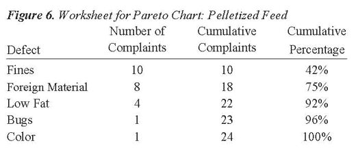
Step 4. Complete the cumulative complaints column by adding, in succession, the number of complaints.
Step 5. Calculate the cumulative frequency by dividing the cumulative complaints by the total number (n = 24) of complaints.
Step 6. Plot the results.
Process Improvement Using a Cause and Effect Diagram
The cause and effect diagram shows in picture or graph form how causes relate to the stated effect or to one another. Also referred to as a fishbone diagram, the main causes or 'bones' of the fishbone are:
- Material
- Machine
- Environment
- Method
- Operator
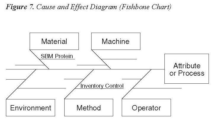
For example, suppose finished product protein content is found to fluctuate by 2 percent. While in most cases the product meets label requirements for nutrient content, management is concerned about giving away protein, which is the same as giving away money. To address this problem, a team of employees, including the production supervisor, quality assurance manager, receiving technician, and lab technician, meet to solve the problem. They use the cause and effect diagram as a guide to discuss the source and solution to the problem. It is discovered that a wide range in soybean meal protein content occurs between lots. The soybean meal protein content is not identified in the warehouse, therefore, it is treated as having the same protein content by production personnel. The team decides to reformulate rations based on 1 percent soybean meal protein increments and identify the protein content of different lots of soybean meal in the warehouse. Therefore, the plant production personnel can match feed rations with the appropriate soybean meal content. The variation in finished product protein content ceases and the company reports a substantial profit increase during the next business quarter.
Summary
Statistical process control (SPC) finds many applications in the feed manufacturing industry. Examples illustrating the application of four SPC tools (frequency histogram, control chart, Pareto chart, and cause and effect diagram) are presented in this bulletin.
Additionally, a list of other ways in which SPC may be applied to control the process and improve product uniformity are presented in the bulletin. SPC relies on the application of statistical principles and procedures to improve product quality and profitability. The benefits derived from SPC in the areas of reduced internal and external failures should offset any additional costs incurred from sample collection, testing, and data analysis.